Guest Post: Effective Indie Film Poster Design from the Experts
A film’s poster is a hugely critical part of getting people to watch your movie. But what can you do to make your film’s poster stand out, amid a sea of marketing and the endless scroll of streaming thumbnails? We asked poster designer and Chargefield creative director John Godfrey for his expert opinion. Here’s what he had to say.
***
Just as a reader may judge a book by its cover, even more so do moviegoers judge films by their posters. It’s easy to understand why, especially in today’s age. With the onslaught of streaming services available to everyone instantly, options are limitless and decisions difficult. Compounding the problem, many of the films available to casual streaming viewers don’t have huge marketing campaigns—meaning that when someone sees a film pop up on Netflix, Hulu, or whatever other service they may be using, it’s often the first time they’ve heard of it.
Enter the poster. As the times have changed, so has the movie poster—and its role in film marketing. Always a staple of the movie theatre, the movie posters we’ve become used to for the past few decades are printed, double-sided, at 27×40” and displayed in a glowing light box.
The key art (the imagery and title) used to make the poster is also typically seen reconfigured on public transit, in magazines and extra-large on billboards and bus shelters. Those posters are usually also just a small part of a multi-million dollar campaign that includes trailers, TV spots, radio ads, talk show guest appearances, product cross-promotion (a bag of BB-8 oranges, anyone?) and more.
However, today’s audiences probably see more movie posters on their streaming services than anywhere else. And many of these posters do not come with anywhere near the scope of the campaigns of summer blockbusters. The takeaway: indie film posters have to work harder.
So, as an indie filmmaker working with a designer, what can you do to make your movie poster work its hardest for you? Keep reading to find out…
PLAN AHEAD
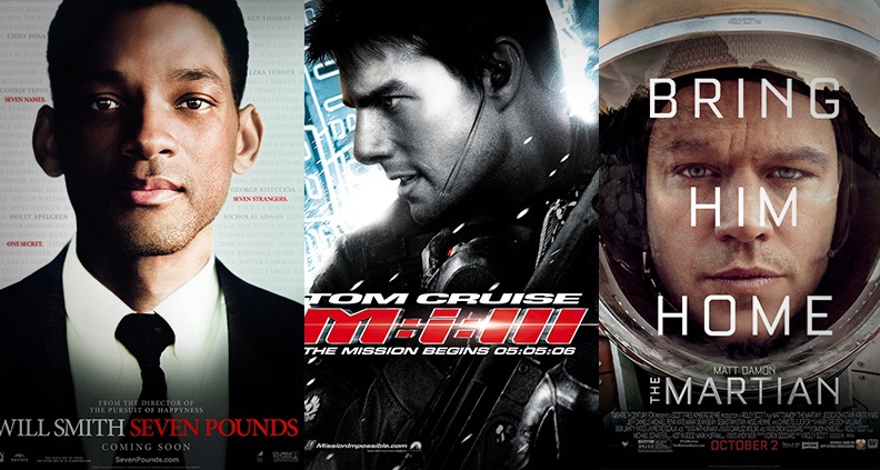
The key to a successful poster is the concept behind it. A typical style of poster we’ve seen in the past few years is what I like to call the “horizontal panels” style, where you see three or more wide and short pictures stacked on top of each other along with the title, filling the vertical space of the poster. Sometimes this route is taken intentionally, but one of the reasons this style of poster is so popular is that you can create it without having access to high-resolution photography, just by using screen grabs from the film. This style of poster is less conceptual and more of an exercise in problem solving, since the appropriate assets weren’t available to the designer.
The easiest way to lay the foundations of a more conceptual, interesting and effective poster is by having great assets for your designer to work with—by having a unit still photographer on set. Not only will you get some excellent images (including some great behind the scenes shots) to use in marketing the film in everything from social media posts to festival brochures, your designer can now work with beautiful high-resolution images and no longer be restricted to certain poster layouts in order to simply get the job done.
If a stills photographer is an absolute no-go, attempt to capture some stills with a high-resolution still camera of actors, noteworthy props, locations, etc. all at a variety of distances, angles and crops (lots of vertical shots as, posters are vertical!) to give your poster a fighting chance.
When you bring a designer on board, give them as much to work with as possible, every available image as well as letting them watch a screener of the film. No amount of synopsis or breakdowns can help a designer understand a film better than watching that film. Film is a visual medium—and so are movie posters. There are many parallels between the two, and there are sometimes iconic graphic devices used within a film that as a filmmaker you might not pick up on, but that a designer’s eye will be drawn instantly to as a subject to expand upon.
SUBJECT
Designers have delivered countless creative posters in the past, with a variety of subject matter on the poster. Sometimes the poster consists of images of the leads, sometimes the poster features imagery that suggests the subject matter and tone of the film simply by using inanimate objects or photo illustration. There’s no “correct” style or subject matter to use on the poster to make it successful, but there are a few things to keep in mind to make it effective.
Big faces of leads aren’t everything. If you think of your poster, inch-by-inch, pixel-by-pixel, as a sales showcase, you begin to reconsider what should be on it. Unless the face is a known actor that will put people in seats (or the streaming queue) by their presence alone, or your actor is delivering an emotive, compelling, funny or raw expression, simply featuring their face may not be the best route. Remember to avoid the floating heads trend of the ‘90s-mid 2000s, which delivers a message as nondescript as the horizontal panels poster. With people on the poster, consider interesting interactions, placements and environments that, when combined, can suggest thematic elements of the film.
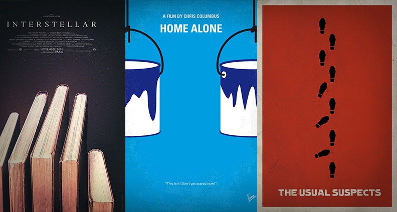
Taking a complete departure from featuring actors—or people at all—you can also consider a poster that focuses on objects that work as visual puns, taps into pop culture, humor, well known iconography, bizarre situations; different is good in a sea of sameness! This will all help establish the vibe of your film. It’s important to remember not to get too weird though—the imagery should give people an idea of what the film is about, not leave them confused.
A good example is some fan made “alternative movie posters” that highlight an element from a film that true fans will understand. Think along the lines of the pigeon-toed footprints of Keyser Söze straightening as they go across a poster. For those who have seen The Usual Suspects, they can appreciate the poster, but everyone else will be scratching their heads and moving on. Remember: every inch of your poster has to be working to sell.
Movies are dramatic, comedic, heartbreaking, thrilling—many times all in a single film. Similarly, they can tackle many themes. Your poster does not have to do this. The more subplots, themes, characters, relationships and genres your poster covers, the more diluted the message will be. Try to describe your film in two or three words, because that level of refined messaging is what’s required to create a poster that can communicate visually just as effectively.
USAGE
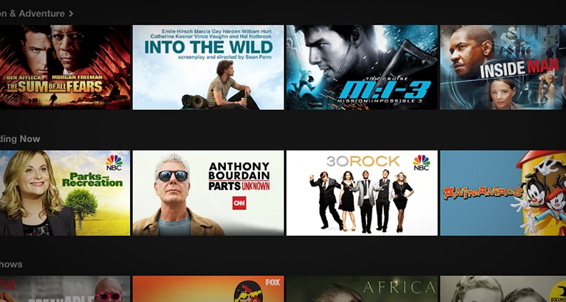
Your traditional 27×40” movie poster is excellent for film festivals and your IMDb page, and is the perfect way to commemorate the countless hours poured into production, with a framed print on your wall. However, that’s only a small portion of the usages your poster will be needed for. Once streaming, your poster will have to be in a horizontal format on many services.
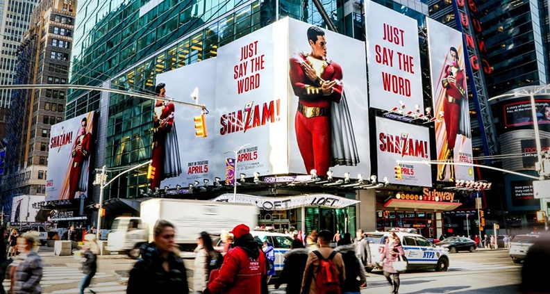
A horizontal format would also be useful right off the bat as the poster frame of your trailer on Vimeo and YouTube. A square format is very useful for social media. When you think about it, the amount of sizes required of an indie film’s key art in today’s age isn’t much different than the blockbusters (see the Shazam! example above) of the past couple decades—except it’s mostly digital.
When you set out to design your movie poster, it’s good to let your designer know that you also require a horizontal layout. This lets them work efficiently from the get-go, being sure to stay away from ideas that may be too reliant on a vertical composition.
THE DETAILS
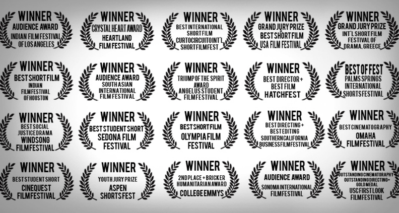
Laurels are great, a symbol of hard work paying off and public appreciation. They do not necessarily need to be on your poster. To the casual viewer they don’t mean much—it becomes background noise, and if you think of your poster as a sales showcase once again, are those pixels better off used by something else? Try your best to trim down the laurels to just the top fests and wins. I’d aim for no more than three, as it isn’t helping you sell as much as a compelling image can.
Similarly, pay attention to actor names outside of the billing block—if they’re plentiful or sized predominantly, it has to be because that name can get people into the seats. Otherwise the space could possibly be used more effectively. “A film by” blocks are another element that may not be required for the same reasons when you’re dealing with limited space.
Hopefully these tips can help navigate the seemingly complex world of poster design! Remember: everything boils down to grabbing the viewer’s attention within an endless sea of options, and you need to make every inch or pixel work its hardest to do just that. Try to view things through the eyes of someone who has no connection to the film, and try to make your decisions with that point of view. Remember your poster doesn’t have to explain everything about the film, and sometimes simple is better—concept is king!
John Godfrey is the creative director at the movie poster design studio Chargefield. His movie posters and titles have promoted or appeared in films at festivals such as Sundance, SXSW, Tribeca, Locarno, Fantastic Fest, and HotDocs among others.
Get More Involved…