
Poster Art That Inspires—Mike Ott Shares the Vision Behind His Work
Award-winning filmmaker Mike Ott’s latest feature, Lake Los Angeles, is the final part of his Antelope Valley trilogy, following Littlerock and Pearblossom Hwy. The U.S. premiere of Lake Los Angeles will take place at the Los Angeles Film Festival on Saturday, June 14. In addition to his work as a writer/director/producer, Ott is also a talented graphic designer and creates the distinctive key art for his films. Here he takes us on a tour of the poster designs for each film in the trilogy, explaining his intentions behind each version.
When did you begin designing posters? Did you learn graphic design while you were studying at CalArts?
Before I was making films I had a small indie record label. I was really interested in how some of the other record labels I really liked had a similar aesthetic where you could go to a record store and, maybe it’s a band you’ve never heard of, but just based on the artwork you could just tell it was part of this record label. I was trying to do that with my record label. I wanted the albums to have similar artwork and I would design the ads so that when you were flipping through a magazine, you could tell it was my label. I went to CalArts and one of my good friends is Brian Roettinger, who is a graphic designer, and he’s gone on to do a bunch of stuff. He just did the new Jay-Z album and Steve Aoki’s new stuff. He’s an amazing, amazing designer. And so the little that I know, I learned from him. But doing graphic design was something I was always interested in.
There is definitely a strong cohesion to all of your work. Besides Brian, are there other artists who you would say influenced your design aesthetic?
For the posters, Saul Bass and late ’70s, early’ 80s new wave/punk art—I think it’s a mixture of those two things. With Saul Bass’ work, I like that they don’t necessarily tell you immediately anything about the film. It’s more like a piece of artwork that you’d want to hang on your wall, as opposed to it being this marketing thing where you understand the story or you have faces airbrushed over a landscape. So, I like the simplicity of Saul Bass’ work. Also, after you watch the film you can look at the poster and see something different in it, which I think is really nice. It actually adds a layer of subtext to the movie that you don’t get upon first looking at the poster.
Littlerock (2010)
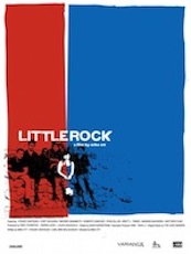
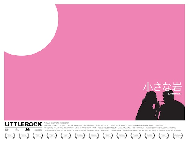
Littlerock is the first feature in your Antelope Valley trilogy and the poster you ended up using does a great job of communicating the main themes of isolation and dislocation while also being really eye catching. There is also another version of the poster with a pink background and a couple in the lower right corner of the frame. What was the evolution of the two versions?
The pink poster was created right before I left for Europe to go on the European side of the festival circuit and I just wanted to have something else to give out. So I did a limited run [of the alternate poster]. That’s one that I wished I had worked on more. I think I spit it out in a month. But I think there is interesting stuff there with Cory and Atsuko connecting with their cigarettes in the bottom. It’s my favorite image from Littlerock.
Were you trying to communicate something specific with the two versions?
For the red, white and blue one, yes. In the poster, she is the part that makes everything come together. She brings all of the colors together and I was trying to get that idea across in the poster.
Pearblossom Hwy (2012)
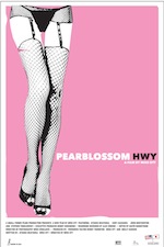
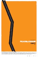
Pearblossom Hwy was your next feature and the final version of the poster has a solid orange background. But there is another version with a woman in a garter belt. They’re very different images. What led you to this final version?
When I made the one with the garter belt, we were still editing the film. So the themes of the film were still kind of developing because of the way we shot it. So what the movie was about was changing as we were cutting it, or what the main theme was about. Initially I just created something to have an image to represent the film, which was the garter belt poster, which I think was based more on what the script was about. Then the film ended up being more about them being stuck somewhere. Pearblossom Hwy is the only way out of the town where they live. At the bottom of the road in the orange poster the highway is broken off, so there’s the idea that they can never escape the town. I think it’s a stronger metaphor for the movie.
Lake Los Angeles (2014)
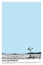
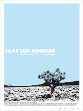
For Lake Los Angeles have you decided on a final version for the poster?
The final version is the one with just the tree, which, in the movie, is kind of the main marker for the little girl. It’s a big identifier in the film. The earlier version was more of a close-up on the tree. The later version with more negative space at the top came from us wanting to take a photo of the actual Joshua tree from the film and put it in there and really try to convey the nothingness that exists out there. Because it is probably the most depressing place in the world, I think. That one captures it better, where I think the earlier versions make it look like there’s a little bit more going on in the way of terrain.
Antelope Valley Trilogy
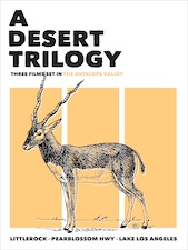
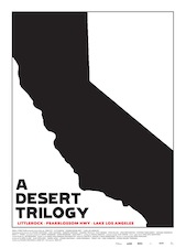
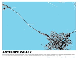
There are three poster designs for the Antelope Valley Trilogy. One features a hand-drawn antelope, another one features the shape of the state of California and the third one features a map of the Antelope Valley area. What was your aim in making a trilogy poster? Was there something about the three films that you wanted to tie together? Did you end up choosing one of these versions over the others?
Yeah, I feel like the map one thematically ties up the films because they all are about location and these intertwining locations. There are locations from Littlerock that are in Lake Los Angeles and there are characters from Pearblossom Hwy that are in Littlerock and characters from Lake Los Angeles that are in Littlerock. So they are all tied together. I think the map one communicates that. With the antelope I was trying to find something that represents the valley, even though it’s an extinct thing there now. And with the California version I’m still working on the California design. I think I’m going to do limited runs of them and I’m going to silkscreen them. There will only be 100 or 200 of each. I might do all three. I think they will all be available eventually, in some capacity.
Check out more of Ott’s poster designs on the Small Form Films website.
Lee Jameson / Film Education Coordinator