
From the Archives: Mitch Paulson and the Art of Color Correction, Part Two
NOTE: The below piece originally ran in 2017. We’re re-posting it here with minor edits to the original text. Special thanks to author Su Fang Tham and subject Mitch Paulson.
***
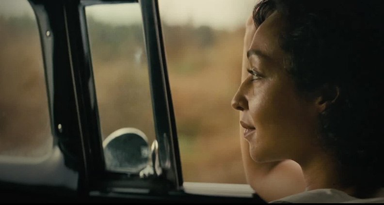
In Part One, we learned about EFILM Supervising Digital Colorist Mitch Paulson’s professional background and got his insight into the complex world of color correction. In Part Two, we’re delving deeper into a single project: Paulson’s work on Jeff Nichols’ 2016 Film Independent Spirit Award nominated historical drama, Loving.
To achieve the mood and tone of the film’s 1960s setting, Loving was shot on film rather than digital. As DP Adam Stone explained, “The film camera added an air of weight for the actors.”
Another clue that helped Paulson know what to aim for was the work of the dailies colorist, who colored each shot briefly before they came to Paulson. The result was an earthy palette that captured not only the story’s period atmosphere and richness of its Virginia milieu.
So what was your process like on this project?
Paulson: I do most of my work with Adam [Stone]. He drives a lot of the look and has been talking to Jeff [Nichols] during the shoot. By the time it gets to me, Jeff is so busy with visual effects, editing and sound, he’ll come in a few times to look at stuff, but usually not until Adam and I have gone through the entire movie. But again, every movie is different. Sometimes I don’t work with the DP. But a lot of the times the DP is sitting with me as I work through each shot.
Are there any shots in Loving where what we finally see on screen isn’t what you started out with at all?
Paulson: There’s a scene towards the end where Richard Loving [Joel Edgerton] is on the porch with snow in the background. A lot of the snow had melted off by that point and green trees surrounded most of the background, so we did a lot of work to put in all the snow. There was another scene looking down the street with buildings on both sides. There was a neon sign on the left side that was originally turned off. Adam thought it would be cool if the sign was turned on, so I outlined the sign, added all the shading, “turned on” the sign and “turned on” the lights in a few of the windows, also.
It’s pretty amazing that you start with “A” and end up with “Z”.
Paulson: That’s the fun part of my job. A lot of people don’t know what we are able to do in color grading. It’s cool that I can show them what’s possible.
Do you ever have to go back to the set designer or costume designer to ask what they were going for in a particular scene?
Paulson: I don’t recall having to do that, but I’ve had wardrobe people come in early on just to see how things will look on the big screen. But mostly once the film gets to me, it’s basically up to the director and DP to tell me what it needs to be.
Was there a scene in the film where you had to bring out a detail that wasn’t in the original footage?
Paulson: A lot of the times people have red in their skin tone, and we’ll take some of that out. On the shot we had talked about, where Richard was sitting on the porch with the snow behind him, I had to select Richard’s face and isolate it because it went too blue when we added blue to cool down the shot overall. So, we made everything around the character’s face a bit bluer but left the face alone. When you’re drastically shifting the look of the shot, you have to keep skin tone in mind—people are still expected to look normal.
Is there any advice you would give to aspiring film colorists?
Paulson: Almost none of us got into this field the same way. Some people came through visual effects, some people were lab timers and some people were doing color for music videos before. There’s no clear path to get into this field. Because digital color grading is still fairly new, we’re kind of the first generation of digital colorists. You just have to get in somewhere and work harder than everyone else and show that you want to do it.
Is there a specific colorist’s work that you admire or find incredibly amazing?
Paulson: When I first got to EFILM in 2005, I worked under Steven J. Scott. He’s definitely one of the first few colorists who came through visual effects, having previously been a [Autodesk] Flame artist. I trained under him for a few years and he became my mentor. I’ve always looked up to him as being one of the best in the field. I got very lucky that I was able to work with him for a few years and he’s taught me a lot.
What makes you get up in the morning excited to go to work?
Paulson: It’s a fun mix of technology and creativity. Every day is different. Things are constantly changing, just between the software I use to the camera they shoot on to the different format we have to release the movie in. Every movie is different and I get to work with a lot of different people.
To read Part One of our interview with Mitch Paulson, click here. To learn more about the The EFILM | Company 3 Feature Film Grant—which provides $50,000 in color correction and digital intermediate services for Film Independent Fellows, alumni of the LA Film Festival and Film Independent Spirit Award Nominees—just click here.
Film Independent promotes unique independent voices by helping filmmakers create and advance new work. To become a Member of Film Independent, just click here. To support us with a donation, click here.
More Film Independent…